

Photo by Alvaro Reyes on Unsplash
A beginner's guide to translating UI designs into functional code using HTML and CSS.


Table of contents


No headings in the article.
Pre-requisites: Basics of HTML, CSS
In this article, you will learn how to analyze and process UI designs into functional code, even if you only have basic knowledge of HTML and CSS. I will walk you through the process of breaking down a given design into different steps and provide you with practical tips and examples along the way.
By the end of this article, you will be equipped with the knowledge and skills to turn most of the UI design into a functional and visually appealing website.
Suppose you are working as a front-end developer on a project, and a designer has provided you with a design that they want you to translate into functional code. To illustrate the process, let's take an example:
Note: The design is got from the frontend mentor website. Thanks, frontend mentor for providing the designs. To know more about frontend mentor – visit their site.
You can even try this challenge by going here
Desktop design:
Mobile design:

One way to approach designing a website that needs to work well on both desktop and mobile devices is to first review the designs provided by the designer. If the designer has not provided mobile-specific designs, it's important to clarify whether the website needs to be mobile-responsive. If so, the designer can be asked to provide mobile designs or, if that's not possible, the website can be adapted by stacking elements vertically to create a layout that works well on mobile devices. This approach can help ensure that the website provides a positive user experience on all devices.
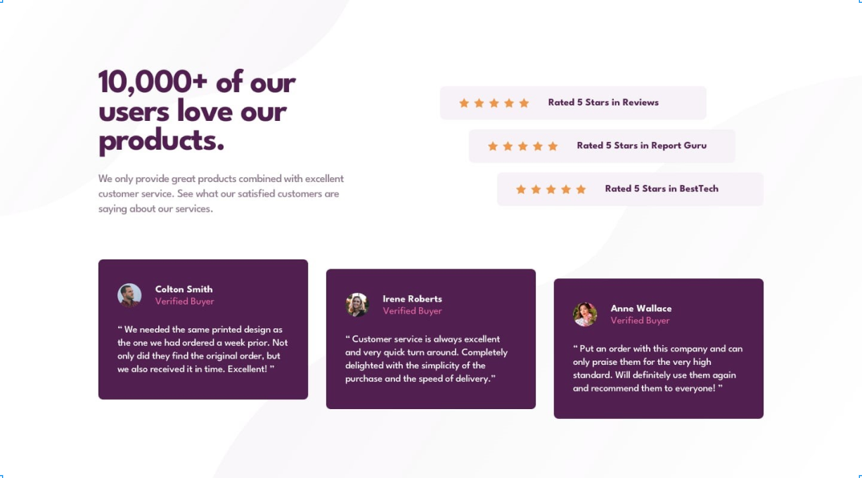
To begin creating a UI design like the given example, the first step is to analyze the design at a higher level. The designer has created a review page that features user review cards, star rating cards, and a catchphrase with a sentence. In addition, the design includes a background image for the entire page, which can be a challenge to implement. However, this will be addressed later in the process.
You can follow these steps in order to have a good idea of how to approach the layout:
- Identify the components that need to be built based on the given design.
- Determine the layout and decide whether to start with the mobile or desktop version.
- Take notes on how to make the layout and content, or take a screenshot and visualize the design by drawing horizontal and vertical lines or simple boxes.
- Divide the design into different parts to get a better idea of the layout.
Here is my basic visualization:

This process of breaking down a UI design and visualizing the layout helps in determining where to use CSS flexbox and grid to create a cohesive overall layout. It's not necessary to do this for every micro part of the design but rather focus on a higher level.
For example, in the given design, a visualization of the layout shows that three flexboxes could be used: one for the main section with the catchphrase and star rating cards, another for the review card section, and a third for each review card to display the profile information. When designing for mobile devices, the flex-direction can be adjusted to achieve the desired UI change.
It's important to recognize that HTML and CSS are vast and no one can know everything about them. It's important to have a mindset of learning as you go and be willing to pick up new concepts as you start building. However, this doesn't mean you can skip the fundamentals of HTML and CSS. It's always helpful to review the basics, and there are many resources available online to help you do so.
When encountering a new problem, this is where you'll learn the most as you explore and try out new solutions. In this case, a quick search on Google revealed that the background-image property in CSS could be used to set the background image for the whole page. With this new knowledge, we now have a solid idea of how to implement the layout for the given design.
Sample code:
<!DOCTYPE html>
<html lang="en">
<head>
    <meta charset="UTF-8" />
    <meta http-equiv="X-UA-Compatible" content="IE=edge" />
    <meta name="viewport" content="width=device-width, initial-scale=1.0" />
    <meta name="author" content="crio.do" />
    <meta name="description" content="A simple social proof section" />
    <meta name="keywords" content="social proof section" />
    <link rel="icon" type="image/png" sizes="32x32" href="images/favicon-32x32.png" />
    <link rel="stylesheet" href="style.css" />
    <title>Social Proof section</title>
</head>
<body>
    <!-- Start of review hero section -->
    <main class="review-hero-section">
        <div class="review-hero-section-item1">
            <p class="heading">10,000+ of our users love our products.</p>
            <p class="heading-content">
                We only provide great products combined with excellent customer
                service.See what our satisfied customers are saying about our
                services.
            </p>
        </div>
        <div class="rating">
            <div class="rate-card card-1">
                <span>
                    <img src="./images/icon-star.svg" alt="star1" />
                    <img src="./images/icon-star.svg" alt="star2" />
                    <img src="./images/icon-star.svg" alt="star3" />
                    <img src="./images/icon-star.svg" alt="star4" />
                    <img src="./images/icon-star.svg" alt="star5" />
                </span>
                <p class="rate-card-text rate-card-text-1">
                    Rated 5 Stars in Reviews
                </p>
            </div>
            <div class="rate-card card-2">
                <span>
                    <img src="./images/icon-star.svg" alt="star1" />
                    <img src="./images/icon-star.svg" alt="star2" />
                    <img src="./images/icon-star.svg" alt="star3" />
                    <img src="./images/icon-star.svg" alt="star4" />
                    <img src="./images/icon-star.svg" alt="star5" />
                </span>
                <p class="rate-card-text rate-card-text-2">
                    Rated 5 Stars in Report Guru
                </p>
            </div>
            <div class="rate-card card-3">
                <span>
                    <img src="./images/icon-star.svg" alt="star1" />
                    <img src="./images/icon-star.svg" alt="star2" />
                    <img src="./images/icon-star.svg" alt="star3" />
                    <img src="./images/icon-star.svg" alt="star4" />
                    <img src="./images/icon-star.svg" alt="star5" />
                </span>
                <p class="rate-card-text rate-card-text-3">
                    Rated 5 Stars in BestTech
                </p>
            </div>
        </div>
    </main>
    <!-- End of review hero section -->
    <!-- Start of review section -->
    <section class="review-section">
        <!-- Start of review card section -->
        <div class="review-card review-card-1">
            <div class="profile">
                <div>
                    <img class="profile-img" src="./images/image-colton.jpg" alt="Colton" />
                </div>
                <div class="profile-data">
                    <p class="name">Colton Smith</p>
                    <p class="verification">Verified Buyer</p>
                </div>
            </div>
            <p class="review-text">
                "We needed the same printed design as the one we had ordered a week
                prior. Not only did they find the original order, but we also received
                it in time. Excellent!"
            </p>
        </div>
        <!-- End of review card section -->
        <div class="review-card review-card-2">
            <div class="profile">
                <div>
                    <img class="profile-img" src="./images/image-irene.jpg" alt="Irene" />
                </div>
                <div class="profile-data">
                    <p class="name">Irene Roberts</p>
                    <p class="verification">Verified Buyer</p>
                </div>
            </div>
            <p class="review-text">
                "Customer service is always excellent and very quick turn around.
                Completely delighted with the simplicity of the purchase and the speed
                of delivery."
            </p>
        </div>
        <div class="review-card review-card-3">
            <div class="profile">
                <div>
                    <img class="profile-img" src="./images/image-anne.jpg" alt="Anne" />
                </div>
                <div class="profile-data">
                    <p class="name">Anne Wallace</p>
                    <p class="verification">Verified Buyer</p>
                </div>
            </div>
            <p class="review-text">
                "Put an order with this company and can only praise them for the very
                high standard. Will definitely use them again and recommend them to
                everyone!"
            </p>
        </div>
    </section>
    <!-- End of review section -->
</body>
</html>
When writing HTML, it can be helpful to use comments to label different sections and make it easier to navigate your code. If you're working on a larger project with multiple components, it's a good idea to label each part with a comment. Additionally, when creating CSS class names, it can be challenging to come up with descriptive and meaningful names. There are various approaches you can follow, such as BEM or OOCSS, but keeping it simple and describing the content can also be effective.
Before diving into setting up typography, variables, resets, and assets, we need to first focus on learning the basics of HTML and CSS. Once you are comfortable with that, we can download and set up all the required assets such as images, sounds, fonts, and icons. Then, we will set our CSS resets and import the necessary fonts using the @import rule.
To make our color scheme consistent and reusable, we can set all the colors as CSS variables in the :root pseudo class. This allows us to easily change the color scheme in one place and have it reflected throughout the entire page.
Sample code:
@import url('https://fonts.googleapis.com/css2?family=Spartan:wght@400;500;700&display=swap');

* {
    margin: 0;
    padding: 0;
    box-sizing: border-box;
}

*::before,
*::after {
    box-sizing: border-box;
}

:root {
    --primary-color: hsl(300, 43%, 22%);
    --secondary-color: hsl(333, 80%, 67%);
    --dark-grayish-magenta: hsl(333, 80%, 67%);
    --light-grayish-magenta: hsl(300, 24%, 96%);
    --white: hsl(0, 0%, 100%);
    font-family: 'Spartan', sans-serif;
}
After this setup, we can start implementing our layout ideas that we discussed in step 1, adding margins and spacing based on the design. We should also add the necessary media queries for mobile devices and make changes as needed for the mobile design.
It's important to note that sometimes we might need to restructure our HTML and work with CSS in parallel to achieve the desired layout. In addition, working iteratively and being willing to make adjustments as we go can help us stay flexible and responsive to changing requirements or unexpected challenges. With a thoughtful and deliberate approach, we can create web layouts that are both functional and visually appealing, and that meet the needs of our users.
Here is the code for the complete design: Complete code link
Links for references:
CSS Resets – meyerweb.com/eric/tools/css/reset
CSS Variables – developer.mozilla.org/en-US/docs/Web/CSS/Us..
CSS Fundamentals – web.dev/learn/css
Responsive Design – web.dev/learn/design